
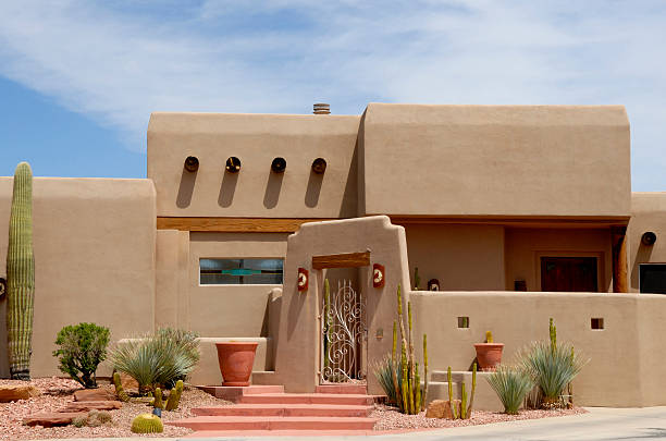
Choosing the perfect off-white paint color for your home can feel overwhelming, especially when there are so many subtle shades to consider. Two of Sherwin Williams’ most popular options, Greek Villa and Alabaster, are often compared by homeowners and interior designers alike. Both shades are timeless and versatile, but the key lies in understanding their differences, where to use them, and how they can transform the look and feel of your space.
Greek Villa vs Alabaster
Greek Villa is a warm, creamy off-white that has a soft, inviting glow. It carries a hint of beige, making it perfect for spaces where you want a subtle warmth without overpowering the room. Alabaster, on the other hand, is a soft, neutral white with slightly more brightness and a delicate warmth. While both colors are understated, Greek Villa leans a little more towards a cozy, traditional feel, whereas Alabaster has a clean, timeless quality that works well in modern settings. Deciding between the two often comes down to the mood you want your space to convey and the lighting conditions in your home.
| Feature | Greek Villa (SW 7551) | Alabaster (SW 7008) |
|---|---|---|
| LRV (Light Reflectance Value) | ~84 — very bright | ~82 — bright, slightly lower |
| Undertones | Warm beige with yellow hints | Neutral greige (beige-gray) |
| Perceived Warmth | Warmer, creamier | More neutral and restrained |
| Lighting Behavior | Looks whiter in bright light; shows warm tones in low/warm light | More stable across lighting conditions |
| Best Uses / Rooms | Cozy, sunlit spaces; traditional or Mediterranean styles | Whole-home white, trim, cabinets, modern or varied finishes |
| Mood / Vibe | Cozy and inviting | Calm, clean, neutral |
| Pairing Suggestions | Warm woods, brass, earthy tones | Cool grays, muted greens, black accents |
| Considerations | May read more yellow in warm/south-facing light — test first | Safer neutral choice if you want to avoid yellow undertones |
Where to Use Greek Villa or Alabaster in Your Home
Greek Villa works beautifully in living rooms, bedrooms, and kitchens where natural light is abundant. Its subtle warmth enhances the feeling of comfort and can make larger spaces feel more intimate. It pairs well with both modern and traditional decor styles, making it a versatile choice for almost any room. Alabaster is ideal for creating a soft, inviting backdrop in spaces like hallways, bathrooms, or cozy living areas. Its neutral tone allows it to blend seamlessly with other colors in your home while maintaining a gentle brightness that doesn’t feel stark.
Greek Villa
When used on walls, Greek Villa provides a creamy, soft base that complements wood tones, warm metals, and muted accent colors. It can make a room feel welcoming and refined at the same time. This color is particularly effective in spaces with ample sunlight, as it reflects natural light beautifully without looking too bright or washed out.
Alabaster
Alabaster offers a slightly brighter alternative that still maintains warmth and elegance. It is particularly suited for rooms where you want a neutral backdrop that allows furniture, artwork, or decorative elements to shine. Its subtle brightness works well in smaller rooms, giving the illusion of more space while retaining a cozy feel.
Coordinating Colors to Pair with Greek Villa and Alabaster
Greek Villa pairs well with soft grays, muted blues, and sage greens. These colors create a harmonious palette that enhances the warm undertones of Greek Villa. For accents, consider richer hues like navy, deep taupe, or terracotta to add depth and visual interest. Alabaster, in comparison, works beautifully with warm neutrals such as beige, soft blush, and earthy browns. Pairing Alabaster with slightly darker accent colors can create contrast and highlight architectural features while maintaining a soft, timeless aesthetic.
Greek Villa Coordinating Colors
Greek Villa’s warm undertones are complemented by muted, earthy shades and natural materials. Soft blues and gentle greens provide a calming contrast, while deeper shades like charcoal or burnt sienna can add drama and dimension to a space. Using these combinations strategically on furniture, textiles, or accent walls can elevate the room’s overall design.
Alabaster Coordinating Colors
Alabaster shines when paired with warm neutrals and subtle pastels. Beige, taupe, and blush tones enhance its soft glow, while darker colors such as chocolate brown or deep gray create a striking contrast. This flexibility allows Alabaster to work in a variety of styles, from modern minimalism to classic traditional interiors.
Trim and Hardware Ideas for Greek Villa and Alabaster
When it comes to trim, Greek Villa benefits from whites that are slightly cooler to create a clean, crisp contrast. Hardware in brushed nickel, chrome, or matte black complements its warmth, providing a modern touch. Alabaster, being slightly brighter, pairs well with soft whites on trim and doors. Warm metals like brass, bronze, or gold accentuate its subtle warmth, making spaces feel inviting and polished. By carefully selecting trim and hardware, you can enhance the overall harmony of the room and ensure that the wall color complements every detail.
How to Choose Between Greek Villa and Alabaster
The choice between Greek Villa and Alabaster depends on several factors, including lighting, room size, and existing decor. If your space receives ample natural light and you want a cozy, warm feel, Greek Villa might be the ideal choice. For rooms with limited light or if you prefer a brighter, more neutral backdrop, Alabaster could be the better option. Testing paint samples on your walls before committing is crucial, as lighting can dramatically affect how each color appears throughout the day.
Greek Villa vs Snowbound
Greek Villa is warmer and creamier compared to Snowbound, which has a cooler, slightly gray undertone. Snowbound works well in modern spaces or rooms that need a crisp, clean backdrop, while Greek Villa adds softness and warmth to any setting.
Greek Villa vs Dover White
Dover White has a subtle beige undertone similar to Greek Villa but is generally lighter and slightly more neutral. Greek Villa provides a cozier feel, making it perfect for creating intimate spaces, whereas Dover White is versatile and works in both traditional and contemporary interiors.
Greek Villa vs Swiss Coffee
Swiss Coffee is a classic off-white with more creaminess and warmth, making it somewhat comparable to Greek Villa. However, Greek Villa has a slightly softer, subtler tone. Swiss Coffee often feels richer and more pronounced, whereas Greek Villa blends seamlessly with a wide range of coordinating colors.
FAQ
Is Greek Villa brighter than White Dove? While Greek Villa has warmth and a creamy undertone, White Dove appears slightly brighter and cooler. The difference is subtle but can affect the overall mood of your room.
What is the difference between Greek Villa and Snowbound? Greek Villa leans warm and soft, whereas Snowbound has a cooler, more neutral tone. Greek Villa creates a cozy atmosphere, while Snowbound provides a crisp, modern look.
Does Greek Villa go with Pure White? Yes, Greek Villa pairs beautifully with Pure White on trim, doors, or ceilings, creating a clean, elegant contrast that highlights architectural features.
Greek Villa vs. Alabaster vs. Pure White? Greek Villa is warm and soft, Alabaster is bright yet subtly warm, and Pure White is neutral and crisp. Choosing among them depends on your lighting, the mood you want to create, and your coordinating colors.


